The different colors on Google Maps generally refer to varying types of government jurisdictions, natural features, and civic areas…
Google Maps Colors
What do the colors mean on Google Maps?
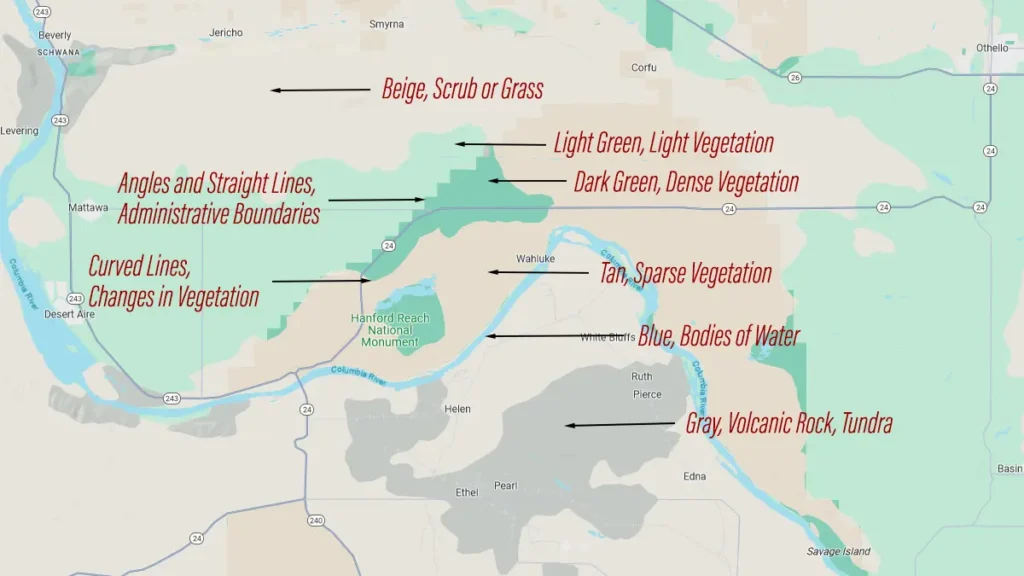
Colors represented on Google Maps reflect various level of vegetation, ranging from (white) no vegetation, to (dark green) heavy vegetation. However, even though this is Google’s intent, it doesn’t always translate when you switch from Map View to Satellite View. This is because Google assigned these colors based on an algorithm that analyzed satellite photography. That satellite photography was not able to reflect vegetation changes accurately.
For example, there are places on Map View colored “Gray” (lava rock, tundra) when in fact there are grasses and scrub. This was caused by color complexities reflected on satellite imagery. In another example, Bonneville Salt Flats shows up as “Beige” (scrub, grass, chaparral) on Map View.

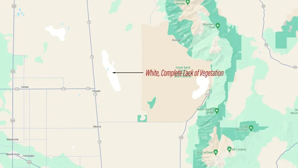
White: complete lack of vegetation, sand dunes, glaciers, mountain peaks

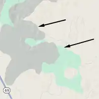
Gray: Lava rock, tundra

Light Gray: Military bases, bombing fields, restricted areas

Tan: Sparse vegetation, rocky ground

Beige: scrub, grass, chaparral

Light Green: Vegetation, trees, brush

Dark Green: Dense vegetation, thick forest
Administrative Boundaries
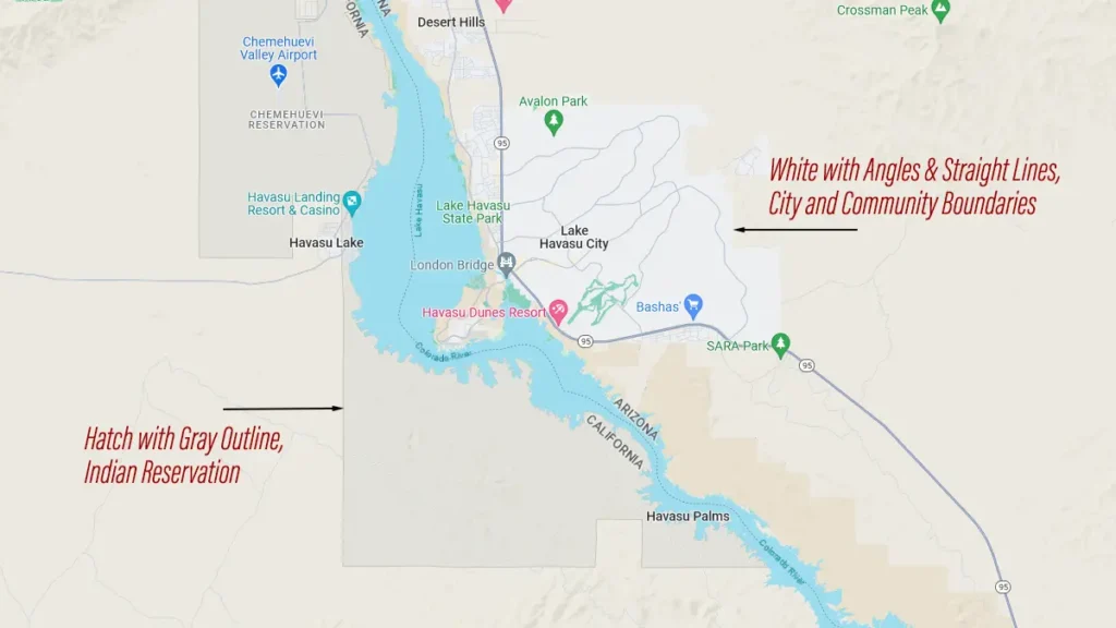
Borders and boundaries of state and national parks, forests, grasslands, monuments, recreation areas, military bases, cities, communities, are all reflected with straight lines and angles. Meanwhile, color changes reflected with curved lines represent differences in vegetation.
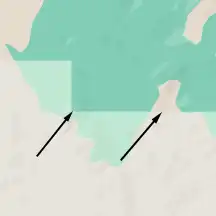
Color changes represented by straight lines and angles: changes in administrative boundaries.
Color changes represented by curved lines: changes in vegetation

Hatch with gray outline: Indian reservation
Cities and Indian Reservations
Cities and communities are all reflected in white with straight lines and boundaries.
Indian reservations are reflected in diagonal hatch lines with gray outline. This hatch representation is overlayed on top of vegetation colors, which creates yet different shades of colors. This is more evident when looking at eastern Oklahoma where the hatch is laid over Tulsa and its parks.
Look at Kansas, it is half green and half off white. East Kansas is mostly flat with lots of wheat and cornfields, very little trees definitely not think vegetation but that area is green on the map, and on the west side has the flint hills, rolling meadows of green but that half is off white. Nobody has been able to explain this. Maybe you can?
The green typically refers to more dense vegetation, like forests, thick scrub, et al. The lighter colors (yellow and white) refer to farm fields, desert, or areas with light vegetation.
This is only a partial answer. What about the other colors? Tan, beige, etc.
In KS, beige is shortgrass prairie and green is tallgrass prairie.
No mention of the DARK BLUE on the shorelines that I am looking for. Are they marine parks, private areas or what?? why make a point of them if you don’t add them to the key??
Check out the white for ‘China Clay’ near Wotter, Plymouth, UK.
Google color scheme is only slightly helpful. What would really help is colors or shading representing area characteristics like: retail, offices, dense tall buildings, blighted neighborhoods, farmland, low-density outlying housing. You can see with their existing colors what if an area is urban AND very green? Or countryside but trashy? What I need is a map that offers better clues as to where to go and where to avoid.
When i view maps on satelite i find very rarely a green shaded rectangle. What does that mean?
Satellite view is for displaying photographic imagery. If you want to see shaded areas, you must switch to msp view
I don’t think this is accurate. When I look at my area, there are lots of areas that are dark green and lighter green. All of the darker areas have a name – some kind of conservation area, state park, wildlife area, etc. There are no names on any of the lighter green areas. That seems like more than a conincidence.
Areas outlined in angular lines are jurisdictions, such as state parks, national forests, refuges, etc. Areas outlined in curved lines represent patches of vegetation (darker green means more thick vegetation, tan means more dirt and sand).
I was looking at google maps in the Rocky Mountain/ Glacier Park region in Northern Idaho, and for the first time, in pretty rural areas I saw pink areas. What the heck is that?
In Northern Idaho, on Google Maps, I believe what you are looking at is actually shades of tan, which would be areas of little vegetation. This is where the mountain peaks reach high enough that trees no longer grow. The few spots of white are areas where there is no vegetation at all.
Glacier (National) Park is in northwest Montana, not Northern Idaho
why is most of Liverpool UK Green when it is a big urban area? most of it should be Grey. This is making a big city look smaller than it actually is
Opaque /ōˈpāk/
Adjective: not able to be seen through; not transparent.
Ok, so Earth is: 197 million square miles…
How much information do you think that is? Obviously Google Maps is NOT exact and most importantly is made to make up your mind and help you get with your aunty not to find a gold mine!!
If you zoom enough not too close and you change from Map, Terrain and Satellite you will find out it would like if Map would be a “pixeled” Satellite Map
@Michael Terry — With all due respect, here in Colorado we use Google Maps to try to AVOID gold mines while hiking. The area west of Alma, CO that includes Mt. Bross and Mt. Lincoln has numerous rectangular areas in white. To the best of my knowledge they represent either mining claims or private property. From a terrain perspective they are no different from the surrounding areas in beige. The color descriptions in this blog are not a full representation of the way colors are used in Google Maps.
I live in Homer Michigan and your grey city shade is wrong. There are over 4,000 ppl in this zip code area. That is spread out between south of Homer and North of Homer with many large businesses to the east of Homer along M60. And west on M60.
I’m talking about the fact tyin towns, some residents or businesses are shaded darker than others. Is there a reason for that?
Thank you for your description. To all those complaining the description is inaccurate, take it up with Google since if they wanted the colors to have a rigid legend, then they would’ve provided a legend.